Venn Diagrams
The Benefits of Using Venn Diagrams to Display Sets
Venn diagrams are a widely used method for displaying sets. One of the biggest advantages of utilizing Venn diagrams is their ability to show the logical relationships between sets. These diagrams are especially helpful for displaying logic and probabilities.
In a probability context, the sample space, represented by 𝛏 (the lowercase Greek letter xi), is the set that encompasses everything being considered. Alternatively, a set can be defined as a group of data points in statistics.
There are two common types of Venn diagrams: those with two subsets and those with three. But how exactly do we draw a Venn diagram?
To create a Venn diagram, there are logical steps that can be followed. Let's use the example of two subsets, labeled as A and B.
- Step 1: Start by drawing two circles with an overlapping section in the middle.
- Step 2: Then, draw a rectangle around the two circles, leaving space between the circles and the rectangle.
- Step 3: Label the rectangle with 𝛏, representing the entire sample space.
- Step 4: Label one circle as A and the other as B, denoting the two subsets.
The final result should look similar to the following diagram:
Venn Diagrams: Uses, Examples, and Making
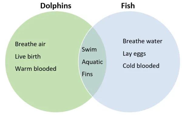
Venn diagrams visually represent relationships between concepts. They use circles to display similarities and differences between sets of ideas, traits, or items. Intersections indicate that the groups have common elements. Non-overlapping areas represent traits that are unique to one set. Venn diagrams are also known as logic diagrams and set diagrams.

The real strength of Venn diagrams comes from their ability to represent interesting relationships in reports and presentations. The alternative is to present lists of attributes and then explain the relationships, which can be tedious. Venn diagrams graphically organize the same information in an easy-to-digest format. Because these charts are so efficient, educators have used them extensively since the mid-20th century as tools to present complex data.
An English logician, John Venn, popularized these diagrams in the 1880s by using them to teach set theory. However, a mathematician, Leonard Euler, created them back in the 1700s. Educators now use them in numerous contexts, such as statistics, probability, logic, business, education, and computer science, among many others.
How to Interpret Venn Diagrams
To interpret Venn diagrams, start by examining all the circles. The group of circles represents the “universe” of concepts that the chart explains. Each circle represents a set of items or an idea. Then notice the areas where the circles do not overlap. Non-overlapping sections indicate that the two groups do not share some characteristics. In other words, some properties are unique to a set. Finally, identify the areas where the circles overlap. Overlapping areas indicate that at least two concepts share some traits. Be sure to notice how many circles overlap.


